Letter shapes

A 13th-century Bible manuscript written in an early form of Gothic script, St. Gallen, Kantonsbibliothek, Vadianische Sammlung, VadSlg Ms. 332

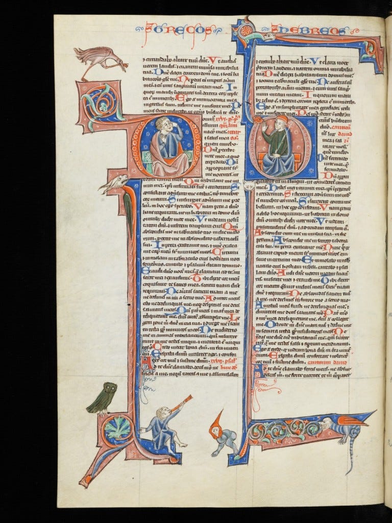
Our history has been shaped by the shape of the letters we write. With this pronouncement ends the second part of the BBC documentary The Secret History of Writing. We are the language we use. We are the letters we write. Cultures generate and respond to scripts, alphabets and letter forms. The scriptorial ecosystem of a given culture creates the conditions for a host of other developments.

Alphabets foster modularity, uniformity and pliability. To control a script is to control its building blocks. Speed is related to efficiency, the faster one writes, the more writing is produced, which benefits everyone, but most of all the scribe. Western scripts developed under the imperative of speed and fuel-efficiency. The letter forms adopted by the first generations of Western printers and typesetters and which became the typographical standards today were the result of a centuries-old experiment in letter forming.

Towards the end of the Middle Ages, the winning principle seemed to be that of economy. The Gothic page was a monument of efficiency. Regular yet compressed, the Gothic script met several requirements: ease and speed of reading in a booming age of information; space-saving in a world where parchment made of animal skin was still freakishly expensive to make; standardisation – manuscripts travelled more than before and a convergence of writing styles was happening.

At least for a while.

The Gothic family of scripts didn’t win in the end as the humanists introduced a novel principle: antiquity. The typefaces we use today, including the font you’re reading right now, are directly related to those developed by the European humanists who, having discovered manuscripts from around 800-900 AD, were convinced that style of writing was that used by the ancient Romans, whom they revered. The older, the better. They were half wrong, as the Carolingian writing they found had developed out of ancient Roman letters, but had opened a passageway of its own. Gothic lost because of a blessed confusion.

We are the letters we revere.

Leave a Reply

Fill in your details below or click an icon to log in:

WordPress.com Logo

You are commenting using your WordPress.com account. Log Out /  Change )

Facebook photo

You are commenting using your Facebook account. Log Out /  Change )

Connecting to %s

Blog at WordPress.com.

Up ↑

%d bloggers like this: